
At StackBlitz, we’re big fans of Storybook and we’re joining the rest of the web ecosystem in congratulating the team on the release of Storybook 8.
In this post, we want to share a few reasons we love Storybook, some of the things we’re most excited about in their most recent release, and a new way you can use Storybook and StackBlitz together.
But first, let’s start with a quick primer…
What is Storybook?
Storybook is a widely-used, open source tool that enables frontend developers to build and test UI components. The open source version (and the commercial version offered by Chromatic) is used by frontend and design system teams at companies like GitHub, Dropbox, and Airbnb in addition to thousands of individual developers.
Its popularity is at least partly explained by how easy Storybook makes it to build, catalog, and test frontend components that are used across different platforms and applications. While Storybook imports the same components that your application uses, it’s entirely decoupled from those apps, allowing you to build, test, and evolve them independently. This concept is what the Storybook team calls “building in isolation” and mirrors the centralized design system approach we see in larger organizations.
What we love about Storybook
Turns out, maintaining a component library in parallel to your core application has a lot of benefits. Storybook enables teams to take advantage of this model in a few key ways:
A single, well-documented catalog
Creating a Storybook site is a rite of passage for any design system team. It’s frequently one of the first ways teams catalog their various components and share them with their users as Storybook makes it simple to reference your components and automatically create a full set of documentation with examples of the different states and properties a component has.
(If you’ve been wondering where their name comes from, the Storybook team calls the in-code expressions of a component’s states and properties “stories.”)
Simplified testing
Testing individual components and their various states in isolation makes it easier to hone in on issues specific to how a component is constructed. This speeds up the development process by preventing teams from debugging various state/platform permutations across multiple applications.
Beyond simple inspection, Storybook allows you to connect real data and combine components together to better simulate how the component will work in production.
Facilitates reuse and collaboration
At the heart of a design system is its ability to reduce the amount of repeated work required when building a new app. Storybook encourages designing components to be reused, reducing the amount of duplicate code. Additionally, it creates a shared space where developers and designers can view and explore the available components and their variations
Large and thriving community
In addition to supporting all of the most popular view layers including React, Vue, Svelte, and Angular, the Storybook team is constantly adding and improving support for the broader web ecosystem.
In his recent talk at ViteConf, evangelist Jeppe Reinhold shared how Storybook has recently improved integration with SvelteKit and Qwik, making it easier for developers using those tools to develop, test, and document their components.
What we’re excited about in Storybook 8
Deeper support for Vite and Vitest
Initially released in 2022, Vite support in Storybook is getting even better with Storybook 8. Notably, Storybook’s Jest-based testing has been retooled to support Vitest. Jeppe demonstrated how this works in his ViteConf talk.
Snappier loads
Storybook 8 is expected to cut load times through a number of performance-focused improvements and optimizations.
Native visual testing
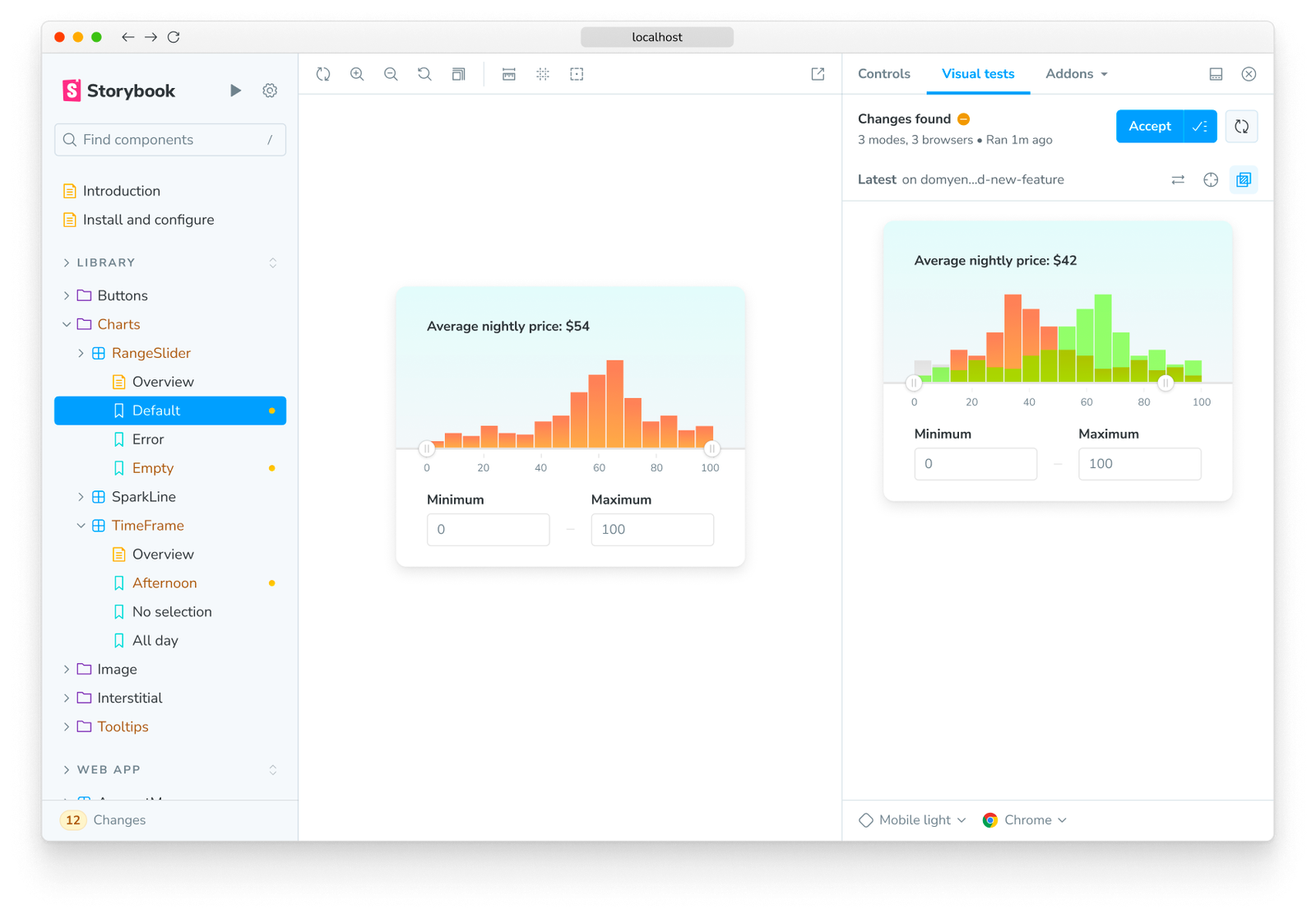
The Storybook team is releasing one of their most popular enterprise features as an addon to their core platform. The Visual Tests addon enables you to compare changes by creating a pixel-by-pixel diff that you can then visually inspect. You can even accept or reject the changes from the Storybook UI, ensuring updates don’t break your components.
Using Storybook with StackBlitz
Storybook’s documentation and testing serves as a foundational piece of any design system. Borrowing from the techniques used by some of the most popular open source projects, design systems teams are increasingly incorporating interactive, fullstack components into their documentation. To make this more accessible for all teams using Storybook, we’re excited to share our StackBlitz addon for Storybook.

With our addon, you can inspect and manipulate a component’s properties in Storybook and then open that component in StackBlitz to start building with it in a fully browser-based development environment. This not only makes it easier to start building with your design system but also helps you get an idea into a working prototype within minutes.
Congratulations again to the Storybook team on the release of Storybook 8. We’re so excited to be a part of the web community with you and can’t wait to see what you build next.
Thank you to the Storybook team for helping to review this post!


